
Before you present a chart to an executive or customer, check whether its headline, measure, comparison, and context support the same claim.
If your slide says “the pilot reduced delays,” but the chart compares the periods before and after launch, the headline claims more than the comparison can show. That is the first thing I would flag.
This is Part 2 of the data-slide pair. Part 1 explains how an accurate chart can still overstate its case. These five questions apply the same check to a working example.
The example: “The new workflow cut onboarding delays”
This slide is synthetic, not client work.
Imagine a proposal deck with this headline:
The new workflow cut onboarding delays.
Below it, a simple chart compares median time from contract signature to completed onboarding in the four weeks before launch and the four weeks after. The median is lower in the later period.
The bars show a difference. GAO’s guide to evaluation design explains that a simple before-and-after comparison can measure change but cannot, by itself, attribute that change to the intervention. Other factors may have affected the result during the same period.
Ask these five questions before you polish the slide.
1. What does the headline ask the audience to believe?
Underline the main verb in the headline.
“Cut” says the workflow caused delays to fall. “Was lower after launch” reports when the measure changed.
The second headline makes a narrower claim. Use a causal headline only when your evidence links the workflow to the change.
2. What does the chart measure?
“Onboarding delays” could mean several things. This chart measures median days from contract signature to completed onboarding.
Use the measure’s name in the headline or a nearby label. If your team defines “delay” another way, say where the measurement starts and ends.
3. What is the comparison?
This chart compares four weeks before launch with four weeks after. It has no concurrent group that stayed on the old workflow.
Put both date ranges on the slide. A label such as “four weeks before launch” and “four weeks after launch” tells the audience what the bars compare.
4. What else could have changed?
Compare the two periods for changes that could affect onboarding time: customer mix, staffing, season, volume, or data collection.
Focus on changes that could shift the median. If customer mix changed, mention it before you credit the workflow for the result.
5. What can you responsibly conclude?
For this synthetic example, use a narrower headline:
Median onboarding time was lower in the four weeks after the new workflow launched.
Put a note beside the chart:
This before-and-after comparison does not isolate the workflow’s effect from other changes during the period.
The headline reports the lower median. The note names what this comparison leaves unresolved.
If you’re deciding whether to continue a small pilot, the lower median is useful context. If you need to know whether the workflow caused it, this chart cannot answer that. You could compare the result with a similar group that stayed on the old workflow.
A four-line review before you send the deck
For each result slide, write down four answers:
- Claim: What does the headline say happened, and why?
- Measure: What was counted or calculated?
- Comparison: Compared with whom, what, and when?
- Limit: What else could explain the result?
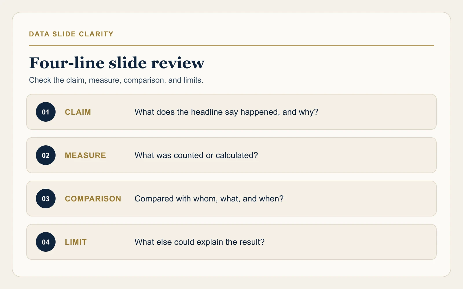
If you can’t answer a line, add context beside the chart, narrow the headline, or gather more evidence before recommending an action.
For an outside review of a current sales deck, script, or delivery sample, request a Free Presentation Diagnostic. The page explains what the focused review covers and what to send.